This redesign started with a simple note in Obsidian:
Simplify. Keep the orange, but have less of it. Too much in nav. Move most of the extra info into pages linked off the About page.
I also wanted something with a sidebar again.
I wanted to stick with the Site Editor, so I used a child-theme of the Twenty Twenty-Four theme generated with Create Block Theme. I went with Twenty Twenty-Four because it purports to be extremely flexible and I wanted to use a theme with the most up-to-date Site Editor tooling and best practices.
The first thing I did was set up my own template parts, overwriting the defaults. It was a bit time consuming, but TT4 doesn’t have a left sidebar or sidebar navigation template or pattern. I made as much as I could reusable as a named template part so I can easily make changes later and keep them consistent across my various templates.
I used some very minor custom CSS (roughly 50 lines), mostly relating to my footer animation and some mobile styles for the navigation.
I decided to go with default system fonts rather than loading a web font. Simplify.
Everything non-essential got removed from the main navigation and either linked in the footer or somewhere more contextually appropriate on a subpage. Navigations on personal websites don’t need dropdowns.
I removed the custom PHP template I had for my Reading page and turned it into a regular page in the editor, and pretty soon I’ll probably remove the custom post type and custom fields that it relied on, too. I don’t think I really need a separate post type, just a list will do. Simplify.
Here is what it looks like:


Places I took inspiration from:
- From Manuel Moreale and Steph Ango‘s post lists on their homepages. I kind of like how both of them have their latest post at the top, which I might adopt. We’ll see.
- From Jeremy Felt, the right aligned titles and how to handle my h-card
- From Footer.design, a bold footer that has a surprise
- From James G, not being afraid to highlight specific sections of my site in my footer that I want people to look at. Things like /now, /uses, /meta, /blogroll
- From my own digital garden, the idea that having the last updated date on pages is useful to understand how fresh or stale they are.
I’m sure there are more folks I took unconscious inspiration from, too!
I included a Meta page in the footer that explains how this site is built and has a rough history of the changes this site has gone through since 2007. It was inspired by Anh, Shea Fitzpatrick, and Jeremy Felt. Since I’m a digital hoarder, I had backups of almost every iteration.
I know it isn’t perfect, but I wanted to ship it and get it live.
Where I want to go next with this:
- Customize some category archive pages with additional info. Things like Photography and Woodworking can use helpful contextful info on the archive pages.
- Continuing to refine pages like /now, /uses, /about, and /blogroll
- Keep improving the mobile styling
- Refining block styles as I use them
- Fixing old posts that now look wonky
- Keep figuring out what I like and what is useful on the homepage
- Style webmentions, pingbacks, and comments better
If you find something broken, please let me know. There are some templates I haven’t touched (though I don’t think anything actually uses them, but I should verify that.) 🚢


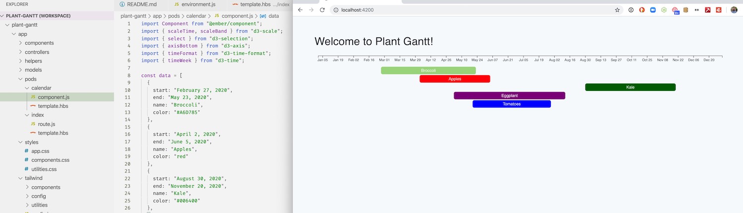
 You see here that blueberries are going off the right side. This is because I was calculating the scale based on the last plant in the list, which isn’t always the one that will be harvested last, only the one that will be planted last.